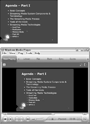
However, the problem is that what looks good (and is legible) on a television screen in general ends up way too small to be read on a small 320×240 screen. Titles at the bottom of the screen (called lower thirds) can be very hard to read if they're not done with large enough fonts. PowerPoint slides are particularly tough, because most people try to pack far too much information into a single slide, which makes it difficult for people to absorb, and the small fonts become very hard to read when reduced. To top it all off, video codecs have a tough time with text, because they don't treat it as being distinct from the video. So when your podcast is encoded, you're going to lose even more quality, as depicted in Figure 10.9.


The PowerPoint slide in Figure 1 isn't too bad to start off with; it has only five main points on the slide. By the time the slide is reduced to 320×240, the sub-points are too hard to read, and after the encoding process, even the main points are starting to look a little ragged.
If you're going to use text in your podcast, think big. Try not to have more than three or four points per slide if you're using PowerPoint, and if you're adding titles to your show and/or your guests, make sure to use a font large enough so that it is legible after the encoding process.
No comments:
Post a Comment